Can I ask what shade you want your logo to be?
A standard question one would hear from a graphic designer, but do you understand it? The answer determines the pace between you and whoever is in charge of creating graphics for your business.
Around 6.8% is the attention span of a typical online user. Then add 50 milliseconds of visuals on the platform they check out (Red Website Design, 2018).
Another statistic you should note is that around 46% of visitors associate credibility with website design.
The crux of your overall design comes in here.
Can you and your graphic designer understand each other’s vocabulary? The answer is the reason why you are here. Or, you know, sheer curiosity as to what this blog is going to tackle.
Either way, welcome to our rendition of what a Designer Dictionary has to say.
Join us as we define common and complex terms just for you to better your brand.
Definition of Terms: Get To Know the Basics
Alright, first things first. Our dictionary would have four sections:
- Design 101: Get to Know the Basics
- Everything Color: The Element that Makes Any Design Vibrant
- Typography: Essential Element to the Style and Feel of Your Logo/Graphic
- Website Essentials: Get to Know What Happens Behind Your Website’s Workings
The terms are arranged based on importance and which should go first in our view.
Let’s dive into them.
Design 101
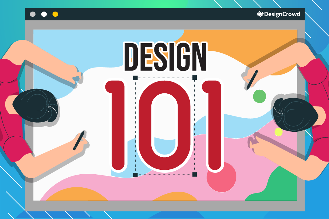
The foundation of a good logo is these terms, especially when deciding the following crucial parts.
Logo Brief
You need to have this prepared when asking a graphic designer to aid you in your design. It usually contains:
- Your Business Name
- Your Desired Design
- Timing
- Budget
- Target Audience
- Goals
Ensure that every piece of information that your designer needs is here and you have open lines of communication for any further questions.
Decide on which type you want to represent your brand.
- Wordmark: Name of Your Business as the Face of Your Brand.
- Emblem: Text Are Inside An Abstract Shape. Sometimes Looks like a Badge.
- Lettermark: An Initial Represents Your Brand.
- Mascot Logo: Colorful Cartoonish Character That Depicts Brand.
- Pictorial Mark: Abstract Shape Represents Brand.
- Logo LockUp: Combination of More than One of Any of the Types.
Image Properties
What dimensions do you want your logo to have?
- Pixels: Smallest Building Block of an Image.
- DPI: Dots Per Inch - measures the quality output of a printer.
- PPI: Pixels Per Inch - measures pixel density used by electronic devices.
- Resolution: Level of Detail an Image Has.
- More Pixels equals Higher Quality
- Lower Pixel Count equals Lower Quality
- Size: Physical Dimensions of an Image (Height & Width).
- Aspect Ratio: The Difference between Pixel Length and Width of an Image.
- Cropping: Removing Unwanted Portions From an Image.
Layout
How are your Image elements placed? If your audience is guided through it all, then it’s considered a great logo.
Balance
Assess the positioning of your image elements. Its elements include:
- Asymmetry: Image Elements are Not Even in Distribution.
- Symmetry: Image Elements are Even in Distribution
- Radical: Image Elements Follow a Circular Form.
Rule of Thirds & Grids
A common term amongst photography, but it applies in graphic design too. It’s the assessment of logo elements inside the nine equal parts of the screen.
Similarly, a grid is various (vertical, horizontal, angular, or curved) lines that guide the organization of elements on a page.
Alignment & Proximity
These two are like peas in a pod because one measures the positioning of logo elements while the other measures the distance between them.
Alignment is the positioning of text and or graphic depending on each other or the background.
While proximity is the distance between logo elements. Its two types include:
- Far Proximity: Little to No Relationship between Elements.
- Close Proximity: Strong Relationship between Elements.
Hierarchy of Components
Organization of design components depending on the level of importance. Usually used when editing a magazine in terms of which headline to give more emphasis.
Opacity
We measure the visibility of the elements within the design and on the background using opacity.
Contrast & Scale
Both measure the difference between logo components, but one focuses more on their size.
Contrast measures the difference between various graphic elements.
In terms of scale, we measure the size of various elements.
White Space
Negative space that contains no graphic or text elements.
Thumbnail Sketch & Mock-Up
These are the last steps to your designs before it gets printed on merchandise or published on a website.
A Thumbnail sketch refers to the rough drafts of an artist before they come up with the final design.
On the other hand, a mock-up is a template created to test initial design ideas and see how they look in the real world. Usually on merchandise as well.
Bleed & Trim
Not to be brutal, but this is an actual term for artists.
Bleed pertains to the color that exceeds the printed edge. This method is to ensure that there are no white spaces upon trimming.
The trim is the finished product of your design. It usually pertains to printed products like business cards or anything you have to cut with your design on it.
Everything Color
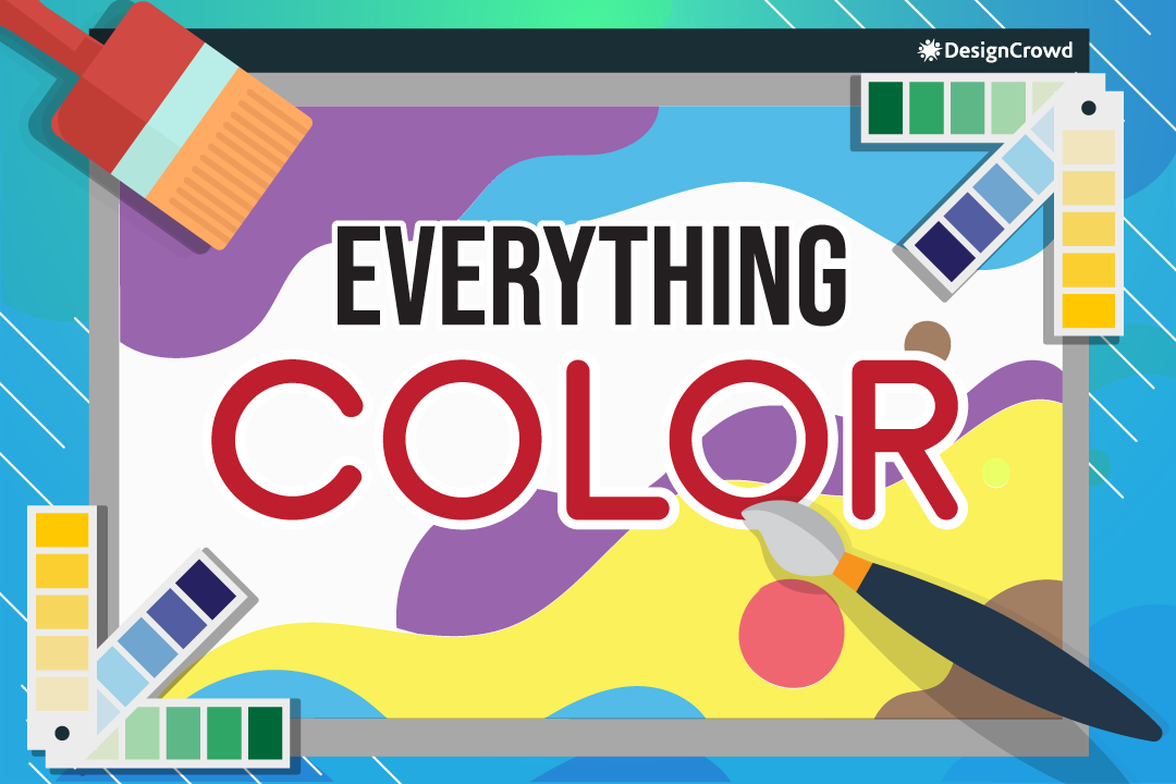
We got past the technicalities, now let’s talk about the color you want for your design.
Color Theory
Each color has its characteristics. When someone sees it, an emotion emerges. Thus, when colors are applied wisely to a design and evokes said emotion, it’s the color theory at work.
Properties, Hex Code, Palette
A color is composed of various aspects, which include:
- RGB: The Primary Colors (Red, Green, Blue)
- CMYK: Printer Colors (Cyan Magenta, Yellow, Black)
- Pantone: Color Blending that enhances CMYK
On the other hand, the hex code identifies color through hexidecimals that include RGB and CYMK.
Lastly, you find all these colors in a palette - the full range of colors in the color wheel.
Pigmentation
These are the terms used to determine the characteristics of each color in a design.
- Hue: True Color - Primary Colors.
- Tint: Colors Lightened Because of Adding White.
- Shade: Colors Darkened Because of Adding Black.
- Tone: Adding Both Black and White to the Chosen Color.
Colorfulness
The determination of the amount of color in a particular graphic describes this portion of the dictionary quite well.
- Saturation: Intensity of Certain Spot on a Graphic
- Temperature: Coolness (Dark) or Warmness (Bright) in the Color Wheel
- Gradient: Gradual Change of Shade in A Color Used
Harmonies
The measure of how colors blend in a graphic.
- Monochrome: Usage of a Single Color with Various Shades
- Complementary: Usage of Colors that are Opposite to Each Other on the Color Wheel
- Analogous: Usage of Colors Adjacent to Each Other
- Triadic: Usage of Three Colors that Have Equal Spaces on the Color Wheel
Typography
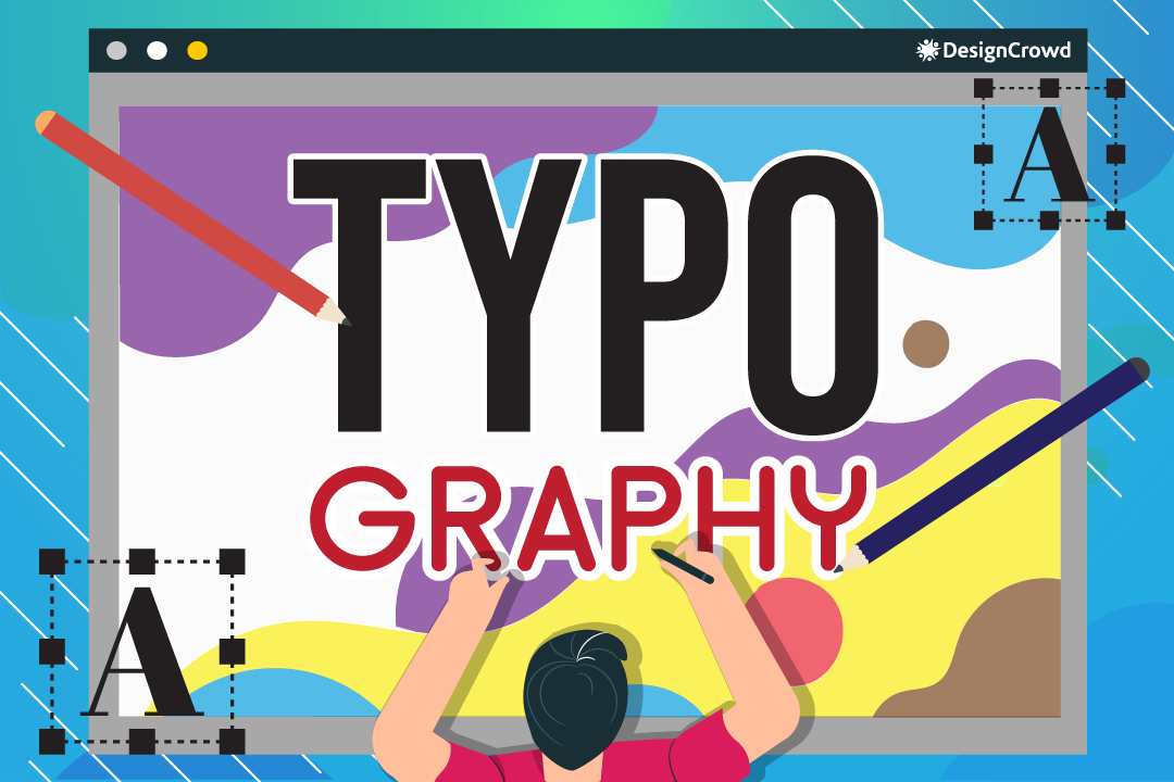
Add some creativity to your logo or graphic with a knowledge of these fonts.
Elements of a Type
You need to have these for your font to express what you want.
- Median: The Maximum Height that Lower-Cases Should Reach.
- Ascender: The Part of The Lowercase Letter that Pops Up of Its Main Body.
- Descender: The Part of The Lowercase Letter that Pops Down of Its Main Body.
- Baseline: The Line that Uppercase and Lowercase Sit.
Font Type
These are the kinds of fonts that would dictate the characteristics of your text.
- Serif: The Letters that Have Hooks on the Tips Called Serifs.
- San-Serif: The Letters have No Serifs.
- Script: The Letters Look Like Handwriting.
- Decorative: The Letters More Like Graphic Images than Text.
Font Case
Make sure to specify which capitalization you want for your font.
- Uppercase: Capital Letters Litter Your Logo or Graphic.
- Lowercase: Small Letters Litter Your Logo or Graphic.
- Small Caps: Capital Letters in the Form of Small Letters Litter Your Logo or Graphic.
Font Style
You can alter your font even more aside from the capitalization and type.
- Italics: Letters Lean To the Right to Catch the Attention of the Viewer.
- Point Size: As the Term Suggested, This is How Big or Small You Want Your Word to Be.
- Font Weight: Letters are bolded.
Font Spacing
Change the appearance of your font with these spacing techniques. They are the vertical and horizontal gaps between your characters.
- Kerning: The Spacing Your Create Within the Same Word.
- Tracking: The Spacing Between Two Lines of Text Vertically.
- Leading: The Spacing Your Create Within A Group of Words.
Website Essentials
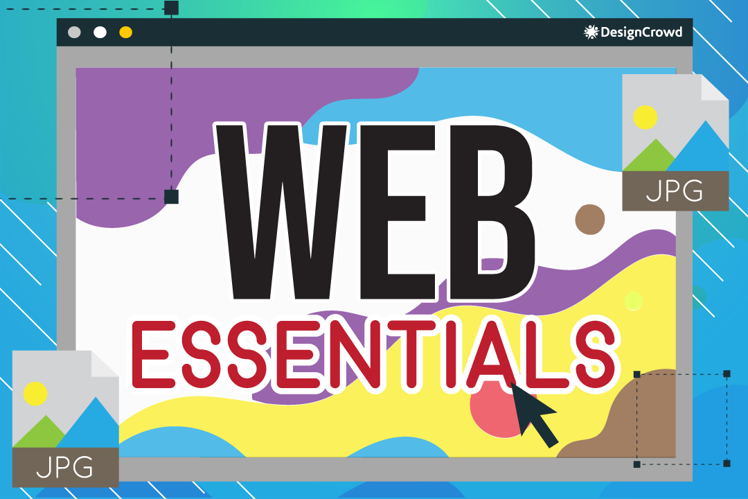
The last portion of our dictionary is all about website terminologies since this is important as a graphic designer and our dear start-up.
Web Page Elements
Without these, your website would be non-existent.
- Header: Part of Your Website Found at The Top of Your Page.
- Navigation Bar: Part of Your Website Where You Can Find the Links to Within Your Website.
- Breadcrumb Trail: The Bar at the Top of the Page that Tells Visitors the Portions of the Page They are On.
- Body Text: The Main Content of The Page that a Visitor Is On.
- Link: Image or Word that Directs Visitor into Another Part of Your Website.
- Sidebar: The Toggle Bar on the Left, Right, Middle of your Page Provides Navigation Links.
- Banner: These are Advertisements That’s Linked To other Websites on the Top Part of Your Website.
- Footer: Any Repeated Design Components Found at the Bottom of the Page.
Raster & Vector Type
These are what you or a designer would use when saving a document or image.
- Raster: Pixel-Based Graphic Resolution for Saving Files and Images.
- GIF: Graphics Interchange Format that Enables Animation and Transparency When Saving. It’s pretty small since it only displays around 256 colors max.
- JPEG: Joint Photographic Experts Group Typically Used for Web Design and Is Compressed for Faster Loading.
- PNG: Portable Network Graphics That Is Also Used For Web Design But Keeps Its Quality When Compressed.
- PSD: Photoshop Document Is Where Designers Work On Graphics before Rastering The Finished Product.
- TIFF: Tagged Image File Format Enables Exchanged of Raster Images Between Various Applications.
- Vector: Curved-Based Graphic Resolution for Saving Files and Images.
- AI: Adobe Illustrator that Enables Saving from the Adobe Systems.
- EPS: Encapsulated PostScript that Enables You to Save Resizable, High-Quality Vector Designs.
- PDF: Portable Document Format that Enables Any Electronic Device to View and Save it.
Let’s Get Designing!
Now you know. You can communicate with your designers and or start designing with these terms added to your vocabulary!
The question now is, are you going to make your logo or ask a designer to help you out? Whichever you choose, we’ve got you covered!
Here at DesignCrowd, you can hire a designer to help you with whatever designing needs you have.
But if you want to try and create your logo to put on any platform, drop by BrandCrowd and browse through thousands of design templates just for you!
Read More On Design Here:
Written by DesignCrowd on Monday, October 25, 2021
DesignCrowd is an online marketplace providing logo, website, print and graphic design services by providing access to freelance graphic designers and design studios around the world.
