Website visitors don't read headlines; they sense your brand first. The brain can tell if a page is trustworthy or confusing in just 0.05 seconds by looking at the colors, spacing, and balance. A visitor makes that decision before logic ever enters the picture, long before they see your call to action.
Design is more than visual polish. It’s the architecture of trust, the emotional logic behind every click. A strong design guides behavior, signals reliability, and quietly persuades without words. In e-commerce, those subtle signals are what transform browsers into buyers.
The Trust Instinct: Why Design Dictates Credibility

Design is the first, and often the only, credibility check your brand gets. The Stanford Web Credibility Project found that 46% of users’ comments about website credibility referred to visual design, layout, color, and typography, not 75% as often misquoted. Design was the top factor influencing first impressions of trust. A clean layout, consistent typography, and balanced whitespace signal competence; cluttered visuals trigger caution and doubt.
Uniformity creates ease. Consistent proportions, alignment, and visuals make it easier for consumers to focus on deciding instead of sorting out the layout. The more convincing a page presents, the more authentic it seems.
A Nielsen Norman Group study reinforces this:users form immediate judgments of credibility from visual design, things like layout, spacing, and color harmony, before they engage deeply with content.
Well-designed e-commerce platforms embody these principles through visually balanced product grids, intuitive navigation, and fast-loading pages that make trust feel effortless. This is why well-structured websites excel. Their clear font, logical product grids, and responsive motion instill a sense of control and credibility.
Clear, consistent web design helps users feel at ease, which research links to higher engagement and purchase intent. A structured, human-centered approach to layout development fosters trust and enhances user experience for businesses aiming to strengthen their digital presence.
Visual Storytelling: Turning Brand Identity into Emotion
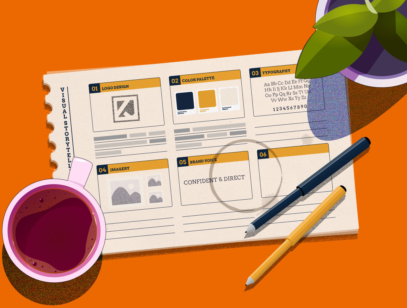
A clear visual identity conveys the message across rapidly than any line of text. People process visuals quickly than words, and they recall what they see more clearly. That's why aesthetic excellence starts with expressing how a brand exists, not just presenting information.
Designing emotional continuity
Your brand's emotional language is formed by color, shape, and images. When these elements stay constant at every touchpoint, consumers start to believe that they are inevitable. People can recognize pictures nearly instantly, and they remember them over words.
Blue conveys calm and reliability. Red drives urgency and energy. Green represents renewal and balance. These psychological triggers influence engagement at a subconscious level. A cohesive color palette should therefore extend across banners, product cards, and CTA buttons, helping users feel at home wherever they land.
Visual context that converts
Contextual imagery closes the emotional gap between intention and action. Instead of isolated product photos, show people using your product, or environments transformed by it. This helps visitors imagine outcomes, not just observe objects. That vision of “what life looks like after purchase” shortens the decision journey.
The logo design services section on DesignCrowd does this well. It presents real-world results, brands before and after professional redesign, giving visitors a visceral sense of transformation. Visuals that demonstrate change build emotional connection, and emotion drives conversion.
Designing for Conversion, Not Just Attraction

Attractive design pulls users in. Structured design keeps them moving. Every layout decision should subtly guide the eye toward the next logical action without friction. The same principle applies to video. When your visual identity carries through into how your videos are presented and delivered, it strengthens recognition and trust. Using a solution with video branding capabilities, such as Cinema8's video hosting platform, helps ensure your content aligns with your brand experience across every touchpoint.
Hierarchy and flow
Visual hierarchy directs attention and sets the pace of reading. Strategic contrast, scale, and spacing lead the user from headline to CTA naturally.
High-contrast CTAs often boost click-through rates; one HubSpot test saw a 32% increase in click-through rates after switching from text to button CTAs. But beyond color, placement, and timing, what matters most is that calls-to-action work best once users fully understand the offer.
Patterns matter, too. Eye-tracking studies reveal that people scan websites in an “F” or “Z” shape. Place essential messages and buttons where the eye naturally travels, top-left for identity, center for engagement, and lower right for conversion.
Whitespace and comprehension
Whitespace acts as a visual pause. It helps the eyes relax and makes it easier to understand information. Based on research from the Nielsen Norman Group, using white space efficiently allows content to be simpler to read and comprehend, which in turn boosts the perception of sophistication and clarity. Strategic use of whitespace also enhances visual engagement by directing attention to key elements and preventing cognitive overload.
Simplicity is not the absence of detail; it’s the discipline of priority. Every element must justify its place. That minimalism amplifies focus, ensuring users spend time where it matters: on your offer.
Speed and interaction as design
Design is no longer separate from performance. Google research shows that 53% of mobile users abandon a site if it takes longer than three seconds to load, while a Deloitte study found that a 0.1-second speed improvement can increase conversions by up to 8%.
Fast design feels effortless. Compressing images, using WebP formats, and preloading key assets make visual experiences instantaneous. Modern users equate speed with professionalism. When a site responds fluidly, it feels alive, and trustworthy.
Consistency and Accessibility: The Hidden Engines of Trust
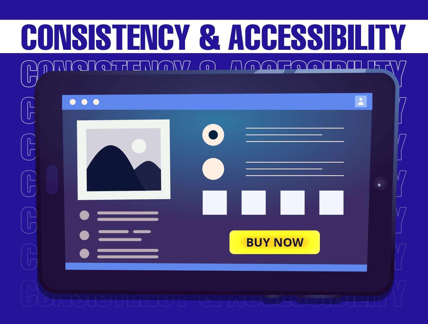
Visual consistency isn't simply keeping a brand alive; it's also reinforcing behavior. Users don't have to learn how to navigate again when fonts, icons, space, and tone stay the same across all touchpoints. That regularity makes things feel familiar, and familiarity fosters trust over time.
Accessibility as strategy
Accessible design is good design. This renders things easier to use for everyone and provides you with more possibilities. High color contrast makes text easier to read, alt text makes it easier for screen readers to navigate, and scalable font sizes make it easier to use on mobile devices. That's not all, these changes also improve SEO and user interaction.
The W3C’s Web Accessibility Initiative notes that accessible design enhances usability and supports SEO best practices, making inclusivity both an ethical and strategic choice.
Conclusion
Good design persuades quietly. It removes doubt, simplifies action, and turns interaction into instinct. When visuals align with behavior, hierarchy guiding the eye, speed matching expectation, color sustaining emotion, design disappears, leaving only confidence.
That’s what platforms like Commerce.com demonstrate: visuals engineered not to impress, but to perform. Businesses that master this balance earn loyalty not through hard selling, but through effortless experience.
For brands aiming to achieve that harmony of clarity, speed, and trust, working with professionals through DesignCrowd’s web design services is the most direct way to turn design into measurable growth.
Written by DesignCrowd on Friday, November 14, 2025
DesignCrowd is an online marketplace providing logo, website, print and graphic design services by providing access to freelance graphic designers and design studios around the world.
