Not every business has a designer on call.
For many small teams, marketing visuals are made between customer emails, product updates, sales calls, and everything else that has to get done that day. One person might be writing the caption, cropping the product photo, choosing the background color, and uploading the final graphic five minutes before it goes live.
That is normal. It is also why brand visuals can get messy fast.
One post uses a dark background. The next uses a pastel template. The website banner feels polished, but the email graphic looks rushed. None of these pieces is terrible on its own, but together they do not feel like they came from the same brand. The same principle applies to logo design—using a consistent logo, color palette, and typography across every touchpoint helps reinforce recognition and makes your brand feel more professional.
The good news is that visual consistency does not require a full design team. It requires a few clear rules, reusable assets, and a workflow your team can actually follow.
Start With What Should Stay the Same
Consistency does not mean every design has to look identical.
It means people should recognize your brand even when the format changes. A social post, email header, website banner, and product image can all look different while still feeling connected.
Start by choosing the parts of your visual identity that should stay the same.
That usually includes your colors, fonts, logo placement, image style, and tone. If your brand feels clean and modern, your visuals should not suddenly look playful and cluttered. If your brand is warm and handmade, your graphics should not feel cold or overly corporate.
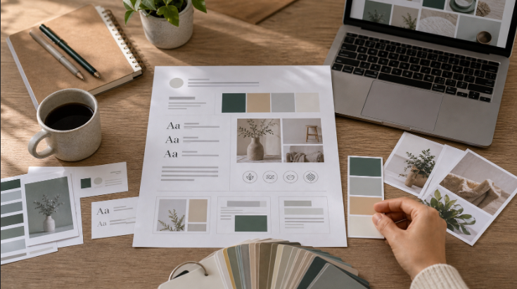
You do not need a huge brand book. A one-page visual guide is often enough for a small team.
Include your main colors, two font choices, a few examples of approved layouts, and a short note about what to avoid. This gives everyone a simple reference before they start creating new assets.
Make Templates for the Things You Repeat
Most marketing teams create the same types of visuals again and again.
There are sale announcements, new product posts, blog thumbnails, newsletter banners, event graphics, customer reviews, and social ads. If each one starts from a blank page, your team will waste time and make different design choices every time.
Templates help solve that.
A good template does not lock you into boring designs. It simply gives your team a reliable starting point. You can still change the image, headline, or offer, but the basic structure stays familiar.
For example, you might create templates for:
- Product launches
- Seasonal promotions
- Blog feature images
- Customer testimonials
- Social media announcements
- Email headers
Once those templates are ready, your team can move faster without reinventing the layout every week.
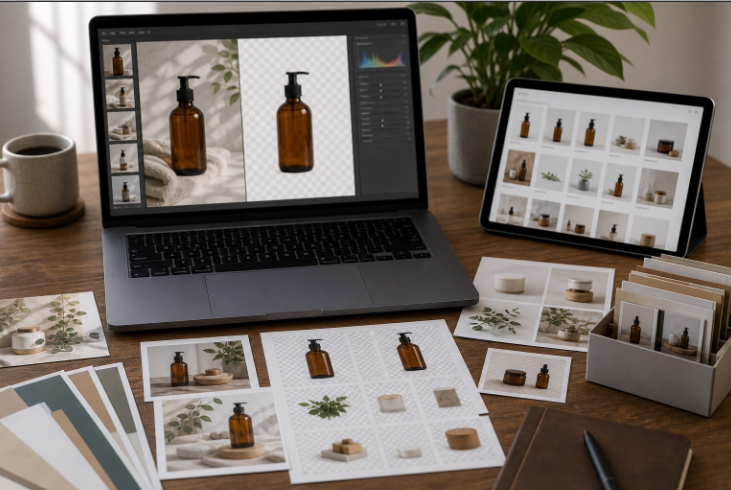
Keep Your Product Images Clean
Product images carry a lot of weight in marketing.
If the image looks cluttered, blurry, or poorly cropped, the final design will usually feel unpolished. It does not matter how nice the headline or template is. A weak product image will pull the whole asset down.
Clean product images are easier to reuse. They can go on a website, in an email, inside an ad, or across social media without fighting the rest of the design.
This is especially helpful for small teams that need to create many visuals from the same product photo. A clean cutout, a simple background, and consistent lighting can make one image work in several places. Try a background remover to make your images pop out more.
Think of your product images as building blocks. The cleaner they are, the easier your marketing becomes.
Build a Small Asset Library
A messy file system creates messy visuals.
If your team keeps grabbing old logos, random screenshots, outdated product photos, or low-resolution images, your marketing will never feel consistent. Even good templates cannot fix bad source files.
Create one shared folder for approved assets.
This can include logos, product images, background patterns, icons, campaign templates, screenshots, and brand colors. Keep it simple and easy to navigate. The goal is to help people find the right file quickly.
A small asset library saves more time than most teams expect. It also prevents small mistakes, like using an old logo or posting a product image that no longer matches your current style.
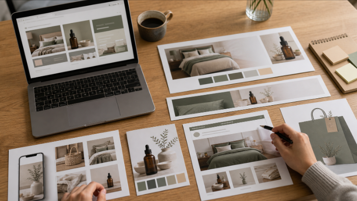
Design for the Channel, Not Just the Brand
A brand should feel consistent, but every channel has a different job.
A website banner can carry more detail. An Instagram post needs to work quickly in a feed. An email image should be clear even when viewed on a phone. An ad needs one strong message and very little distraction.
This is where small teams sometimes struggle. They use the same image everywhere and hope it works.
A better approach is to keep the brand style consistent while adjusting the layout for each platform.
For example, if you are creating social graphics, tools like Design.com’s social media templates can help you think through common formats and channel-specific layouts. You can keep your colors and style, but still design for the space where the visual will appear.
The same idea applies to print, web, email, and ads. The brand stays recognizable. The format changes to fit the job.
Do Not Put Everything in One Graphic
When there is no designer involved, people often try to make one visual do too much.
A single banner might include a product photo, headline, discount, logo, badge, date, long description, and call to action. Technically, all the information is there. Visually, it is exhausting.
Strong marketing visuals usually have one main job.
Before you create a graphic, ask one simple question: What should the viewer notice first?
If the answer is not obvious, the design probably needs editing. Move extra details into the caption, email body, product page, or landing page.
Simple visuals are not lazy. They are easier to understand.
Use AI to Speed Up the Repetitive Work
Small teams do not need to do every design task by hand.
AI tools can help with resizing, image cleanup, background changes, object removal, and quick visual variations. Used well, they can reduce the boring parts of production and give your team more time to think about the message.
The trick is to use AI inside a visual system.
If every AI-generated image has a different style, your brand will look scattered. But if you start with clear colors, templates, and approved assets, AI can help you produce more content without losing control.
For example, a team might use AI to prepare product images, clean backgrounds, or create variations for campaigns. A clean image editing workflow can make it easier to turn raw visuals into assets that fit the rest of your marketing.
That is the sweet spot. Let AI handle some of the production work, while your team keeps control of the brand direction.
Use Design Support When It Matters Most
Templates and AI tools can carry a lot of day-to-day marketing work.
Still, there are moments when professional design help is worth it. A major rebrand, product launch, packaging update, or website redesign may need more than quick edits and templates.
That does not mean you need to hire a full-time team.
For bigger creative projects, platforms like DesignCrowd can help businesses work with designers on logo, web, and graphic design projects. This can be useful when you need a stronger foundation before building out your everyday marketing materials.
Once the core direction is set, your team can use templates and AI tools to keep future assets aligned.
Keep Your Brand Materials Connected
Marketing visuals do not exist in isolation.
A customer might see your Instagram post, visit your website, download a flyer, and then receive an email. If each touchpoint looks unrelated, the brand feels less trustworthy.
That is why connected materials matter.
Your business card, website, social graphics, ads, and email visuals should feel like parts of the same system. They do not need to match perfectly, but they should speak the same visual language.
If you are building those materials from scratch, resources like BrandCrowd’s design templates can offer useful starting points for common brand assets. The important part is to choose a direction and stick with it.
Review Everything as a Set
Before publishing a campaign, look at all the visuals together.
Open the social post, email banner, ad creative, website image, and product graphic at the same time. Ask whether they feel connected. If one piece looks like it came from a different brand, fix it before the campaign goes live.
This review does not need to take long.
Five minutes is often enough to catch mismatched colors, inconsistent image styles, crowded layouts, or old assets. It is much easier to fix these problems before publishing than after people start seeing the campaign.
Create a Simple Workflow Your Team Can Repeat
Consistency becomes easier when the process is clear.
A small team could use a workflow like this:
- Choose the campaign goal.
- Pick the right template.
- Select approved images and brand assets.
- Add the headline and call to action.
- Check colors, fonts, and spacing.
- Resize for each channel.
- Review all visuals together before publishing.
This process is not fancy, but it works.
It gives your team a rhythm. It also makes it easier for new team members, freelancers, or marketers to create visuals that feel on brand.
Final Thoughts
You do not need a full design team to create consistent marketing visuals.
You need a few rules, a clean set of assets, reusable templates, and a process people can follow. That might sound basic, but basic is often what keeps a brand looking professional.
AI tools can help speed things up. Templates can keep layouts steady. Professional design support can help with bigger brand moments.
But consistency comes from the system behind the visuals.
When your team knows what to use, where to find it, and how each asset should feel, your marketing starts to look more confident. Customers notice that. They may not describe it as “brand consistency,” but they feel it.
And in a busy market, that feeling matters.
Written by DesignCrowd on Friday, July 3, 2026
DesignCrowd is an online marketplace providing logo, website, print and graphic design services by providing access to freelance graphic designers and design studios around the world.
