Designing an app icon can feel overwhelming. You want it to stand out, look professional, and instantly tell users what your app is about—but where do you start?
The good news is you don’t need to be a design expert to create a great icon. With a few key principles, you can make an icon that grabs attention and leaves a strong first impression.
In this guide, we’ll walk through the essentials of how to design an app icon.
Let’s get started!
What Are App Icons?
Source
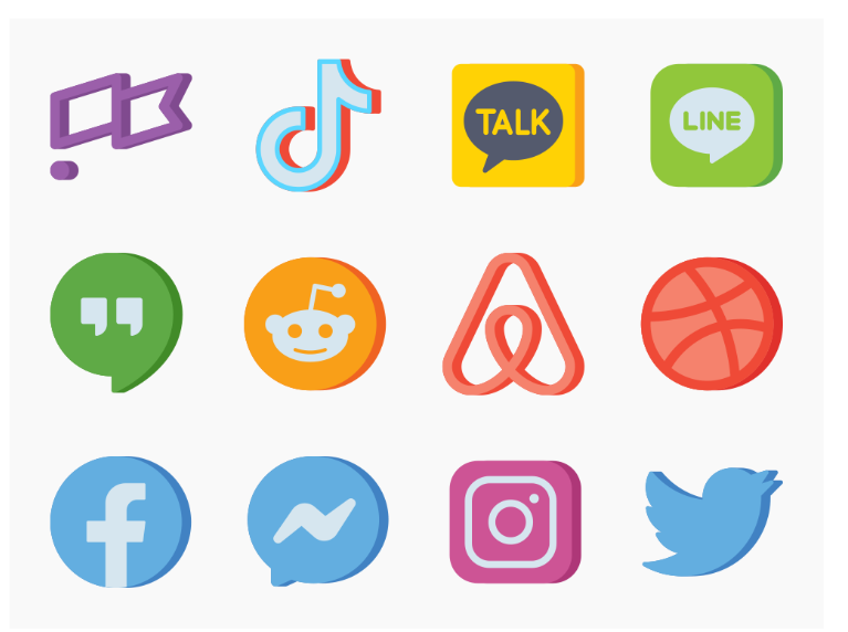
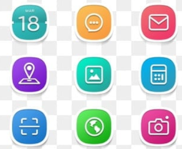
App icons are small, clickable images representing an app on a user’s device. They act as a visual identity for your app, helping users recognize and remember it instantly. More than just a logo, a well-designed app icon grabs attention, communicates the app’s purpose, and makes it stand out in a crowded app store.
Since it’s often the first thing users see, a strong app design can distinguish between someone tapping to download or scrolling past.
App Icons vs Logos
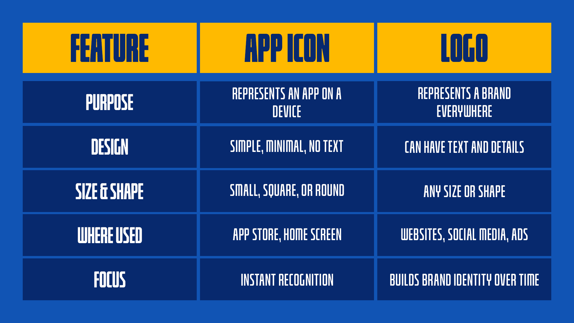
App icons and logos might look similar, but they have different jobs. A logo represents a whole brand and is used everywhere—on websites, social media, and packaging. It can have detailed designs, text, and different shapes.
An app icon is made just for mobile or desktop apps. It must be simple, straightforward, and easily recognizable, even at a tiny size. Because of this, app icons usually avoid too many details or words. The goal is to stand out in app stores and on home screens.
While logos help build brand identity over time, app icons need to grab attention instantly. Some brands adjust their logos to work as an app icon, while others create a separate design that matches their overall look.
Relevant: If you want to create a logo, check out Design.com’s AI logo generator and get a custom logo in just a few minutes!
Here’s a table that shows the difference between the two:
Importance of a Well-Designed App Icon
Here’s why having a great app icon matters:
- First Impressions Matter: Users make quick decisions based on visuals. A polished, professional icon instantly grabs attention and sparks interest.
- More Downloads: The right design can make your app more appealing, leading to higher install rates and better engagement.
- Stronger Brand Recognition: A unique and memorable icon helps users recognize and remember your app.
- Better User Trust: A clean, high-quality icon signals reliability and professionalism, making people more likely to try your app.
- Increased Visibility: A standout icon in a crowded app store helps your app stand out.
Key Principles of Effective App Icon
Check out these essentials of effective mobile app icon design:
1. Keep it simple and clear
A great app icon should be easy to recognize at a glance. Too many details can make it look cluttered, especially at smaller sizes.
Avoid using too many colors, complex patterns, or text. A simple shape or symbol representing your app’s purpose will be more effective and memorable.
Clean designs are always more visually appealing.
2. Make it scalable
Your app icon needs to look good at any size, from tiny notification icons to large displays. If it’s too detailed, it may lose clarity when scaled down.
Test your icon at different sizes to ensure it stays sharp and recognizable. A strong silhouette and balanced design will help maintain its impact, no matter where it appears.
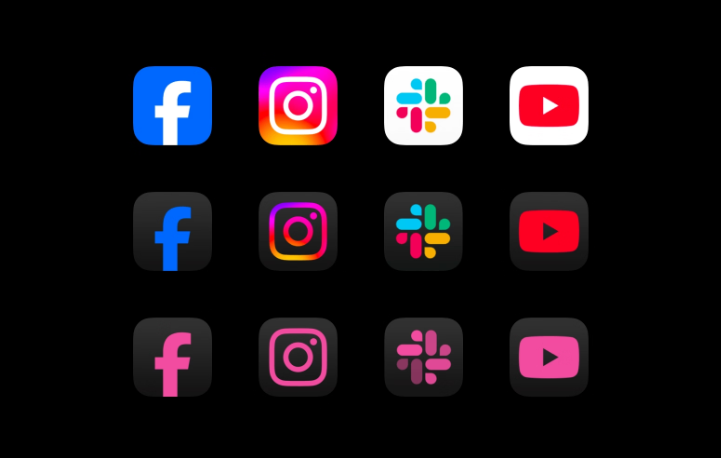
3. Use colors wisely
Color plays a significant role in grabbing attention and setting the right mood. Bright, bold colors can make your icon stand out, while softer tones create a sleek and modern feel.
Stick to a limited color palette to avoid a messy look. Also, ensure good contrast so your icon remains clear on light and dark backgrounds. Choosing the right colors can make your icon instantly recognizable.
4. Stay consistent with branding
Your app icon should reflect your brand’s identity. This helps users connect it with your app and company.
If you already have a logo, consider using its elements in your icon. A consistent look across platforms builds recognition and trust, making your app more memorable.
Platform-Specific Design Guidelines
Each platform has its own design rules for app icons. iOS and Android have different shapes, styles, and requirements, so optimizing your icon for each ensures a polished and professional look.
iOS App Icon Guidelines
Source
Apple requires app icons to be square with rounded corners. The system automatically applies the rounded effect, so you should design your icon as a complete square to avoid unwanted cropping.
iOS icons should have a simple, flat design without transparency. Apple encourages consistency across all app icons, so avoid unnecessary details or text. A high-resolution image (1024x1024 px) is required for the App Store.
Android App Icon Guidelines
Source
Android icons are more flexible and support adaptive shapes. Depending on the device and launcher settings, they can appear as circles, squares, or other forms.
Google recommends using a background layer and a foreground layer to create depth. Transparency is allowed, giving more creative freedom than iOS. Icons should be designed at 512x512 px for Play Store submission.
How to Design an App Icon
Follow these simple steps to create the perfect mobile app icon design for your brand:
- Understand Your App’s Purpose: Your icon should instantly communicate what your app does. Take time to define its core function and how you want users to perceive it.
- Sketch Out Ideas: Before starting digital design, brainstorm and sketch different concepts. Play with shapes, symbols, and layouts to find a design that effectively represents your app.
- Choose Colors and Shapes Wisely: Colors evoke emotions, so select a palette that matches your brand’s personality. Keep the shape simple and bold, ensuring it remains recognizable.
- Test at Different Sizes: A great app icon must be transparent even at its smallest size. Shrink your design and check if it still looks sharp and readable. Avoid tiny details that might blur or disappear.
- Follow Platform Guidelines: iOS and Android have different icon requirements, from shape constraints to resolution needs. Sticking to these ensures your icon looks polished and professional across all devices.
Conclusion
That’s it! A great app icon isn’t just about looking good—it’s about making your app easy to recognize and remember. Keep it simple, follow platform guidelines, and make sure it stands out. With the right design, your app can grab attention and leave a strong first impression. Partnering with a team that offers custom iOS app development services can also help ensure your app’s design feels polished, professional, and user-friendly from the start.
Go and create something extraordinary!
Read More on Designs Here:
Written by DesignCrowd on Friday, March 7, 2025
DesignCrowd is an online marketplace providing logo, website, print and graphic design services by providing access to freelance graphic designers and design studios around the world.
